VIRGO MOON ALCHEMY
THE CLIENT:
Virgo Moon Alchemy is a cosmic candy apothecary that blends herbalism, astrology and sensory experience into small-batch confections. The brand invites customers to explore astrology and herbalism through flavor first, understanding later.
THE BRIEF:
Virgo Moon Alchemy needed a welcome sequence that could introduce the brand’s unconventional blend of astrology, herbs and flavor in a way that felt approachable to both spiritually curious customers and complete newcomers alike. The goal was to reduce hesitation without losing the intrigue and discovery that make the brand memorable.
THE CONCEPT:
The sequence was built around curiosity before explanation.
Rather than over-explaining astrology or herbalism upfront, the emails lead with the sensory experience, encouraging customers to follow what naturally draws them in. As the sequence unfolds, deeper layers of the brand are introduced through storytelling and subtle educational touchpoints woven naturally into the customer journey.


PHANTOM FOUNDRY WAX CO
THE CLIENT:
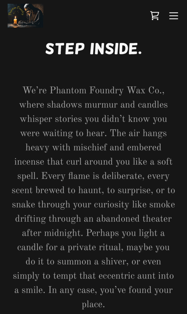
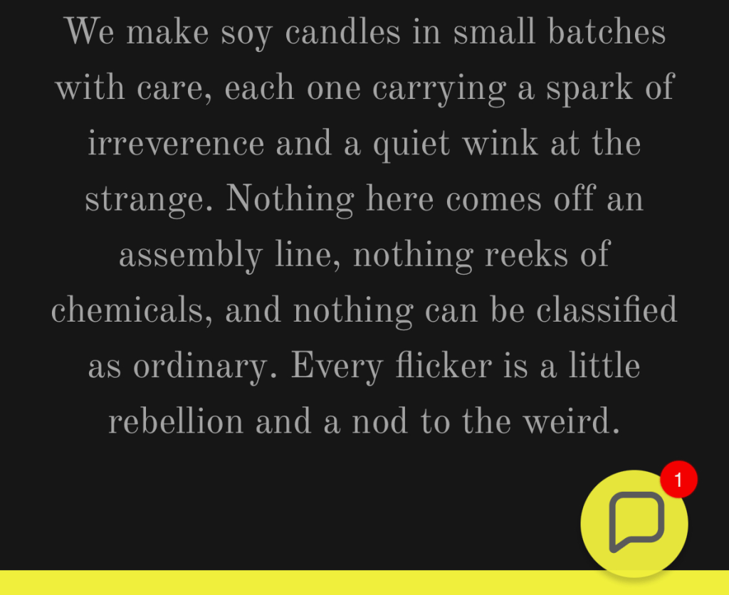
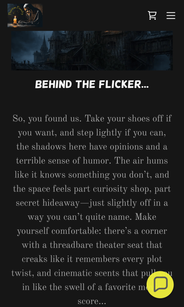
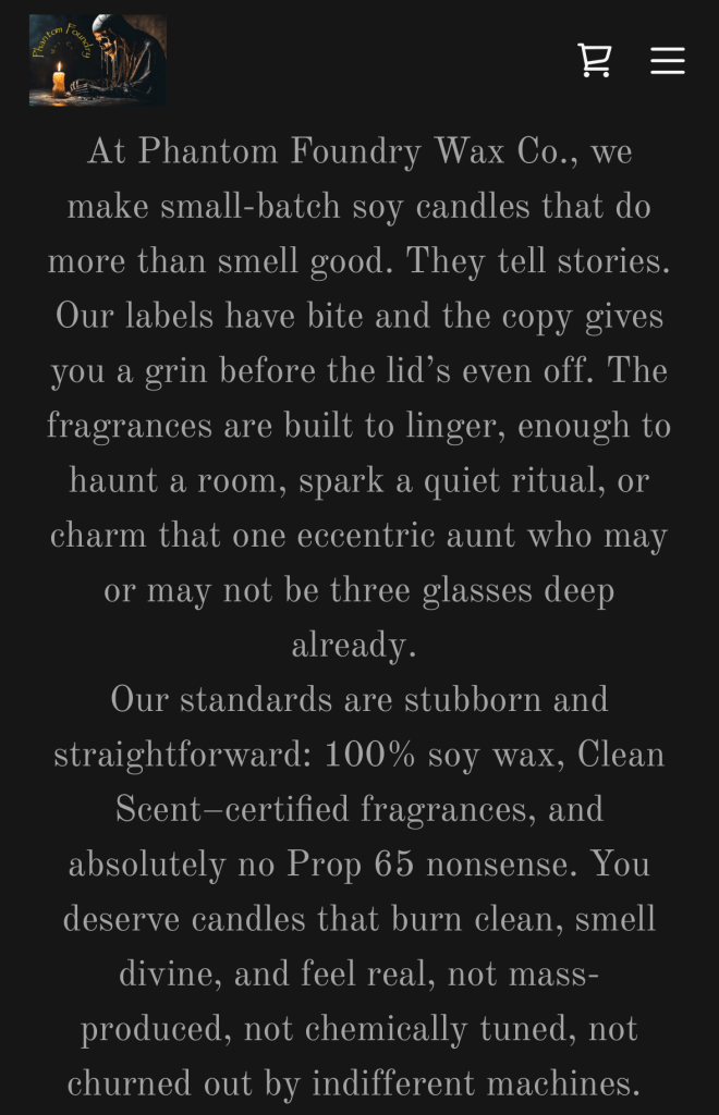
Phantom Foundry Wax Co is a small-batch candle brand rooted in mood and atmosphere. With a darker, industrial aesthetic, the brand creates candles that feel less like décor and more like artifacts pulled from a workshop of smoke and shadow.
THE BRIEF:
Phantom Foundry Wax Co needed a homepage and about page that could better define the brand while strengthening emotional connection. The goal was to refine the voice, clarify the brand story and create a more immersive buying experience that helped first-time visitors understand both the products and the atmosphere behind them.
THE CONCEPT:
Atmosphere is forged, not poured.
The homepage was rebuilt to immediately pull visitors into the world of the Foundry while balancing immersion with clarity around craftsmanship and ingredients. The about page grounded the darker aesthetic in something human, revealing the maker’s wicked sense of humor and attention to detail.
The result is a voice that feels cinematic and memorable, positioning Phantom Foundry Wax Co as more than a candle company, but a brand people step into.

MOON & MORTAR
THE CLIENT:
Moon & Mortar is a witchy apothecary offering herbs, candles, and ritual tools for modern practitioners. Rather than prescribing a single path, the brand creates space for people to discover what feels meaningful and build rituals that reflect their own experience.
THE BRIEF:
Moon & Mortar needed an about section that could clearly define the brand’s personality while grounding its mystical aesthetic in something approachable and relatable. The goal was to create a voice that felt distinctive without becoming abstract, while reassuring visitors that ritual here is personal, flexible and free from pressure.
THE CONCEPT:
Ritual, without the pressure.
The copy positions Moon & Mortar as a space where intuition leads and perfection isn’t required. Instead of focusing on elaborate spiritual practices, the messaging highlights small, meaningful moments, lighting a candle with intention, steeping herbs as a pause, allowing rituals to form naturally over time.

HIGH LIGHT RITUALS
THE CLIENT:
High Light Rituals is an energy healing and crystal jewelry brand focused on intentional support, energetic alignment, and spiritual self-development. Through crystal jewelry, intuitive work, and energetic guidance, the brand helps people reconnect with themselves in a way that feels grounded, accessible, and deeply personal.
THE BRIEF:
High Light Rituals needed a welcome sequence that could introduce new subscribers to the deeper philosophy behind the brand without overwhelming them. The goal was to create a more intentional onboarding experience that acknowledged different emotional and energetic needs while guiding customers toward the products, practices, and support most aligned with where they were.
THE CONCEPT:
Different people arrive carrying different things.
Instead of a traditional linear sequence, the welcome flow was structured as a guided 3-path journey centered around protection and grounding, inner stability and self-trust, or clarity and expansion. The opening email introduces the philosophy behind the brand while inviting subscribers to choose the type of support they feel most drawn toward.
Each path unfolds gradually through emotional resonance, crystal education, intentional practices, and optional deeper support. Crystals are positioned not as passive accessories, but as energetic tools people can actively work with in everyday life, making the onboarding experience feel more like guided support than a traditional marketing funnel.

TWO SOULS FLORAL (SPEC AD)
The Client:
Mother and daughter duo Vera & Violet Williams own and operate Two Souls Floral shop in Denver. They are renowned for their partnerships with local farms that provide in-season flowers for their unique arrangements.
The Brief:
Vera & Violet wanted to increase their number of bulk orders, specifically for weddings. They offered a free consultation to anyone with an upcoming wedding, knowing that once the bride saw what they could do, they’d have a new client.
The concept:
It’s all about passion. The bride is passionate about her groom, the groom is passionate about his bride and Two Souls is passionate about providing high-quality, sustainable floral arrangements.

DELIX & COMPANY “ABOUT US”
The Client:
Delix & Company was founded by an avid outdoorswoman and mother of two young children, inspired by real-life movement, multitasking, and the universal frustration of pocketless pants.
The Brief:
Delix needed website copy that clearly communicated the problem their product solves, highlighted its thoughtful design, and connected with active, on-the-go people who need hands-free storage without sacrificing comfort or style.
The Concept:
Built from lived experience. The copy leans into humor, relatability, and practicality—positioning the adjustable waist pack as more than a running belt. Whether you’re running for fitness, travel, or everyday chaos, Delix is about lightening the load and moving freely through modern life.


UNFOLD YOGA LANDING PAGE (SPEC AD)
The Client:
Unfold Yoga is a yoga studio that focuses on teaching the mental and spiritual aspects of yoga as well as the physical.
The Brief:
Many larger gyms offer yoga classes as a part of their giant class catalogues, often as a “one-size-fits-all” course. Unfold was looking expand their clientele by demonstrating their yoga expertise to potential customers through their weekly newsletter and allowing them to experience the difference with a free class; all they need is an email address to claim it.
The Concept:
Everybody’s stressed. Not everybody knows about the stress relieving properties of yoga. This landing page is an invitation to learn a little more, no strings attached.
